
Internship-On-Demand
Turning Frustration Into Opportunity
Internship-On-Demand (IOD) is an online platform designed to connect college students with employers through skill-building modules, assignments, and digital portfolios.
But while the mission was clear, the user experience was not. Students were confused by unclear labels, inconsistent navigation, and a lack of feedback when completing tasks.
As part of a UX research team, I set out to identify where students struggled and how to improve the platform’s usability, particularly around two key student goals: submitting assignments and building a public portfolio.
My Roles:
• UX Designer
• UX Researcher
UX Methods:
• Contextual Inquiry & User Stories
• Cognitive Walkthrough/Website Audit
• User Flows
• Site Map
My Tools:
• Figma
Deliverables:
• High Fidelity Interactive Prototypes of Portfolio Feature and Assignment Portal Feature
• Annotated Prototypes
The Problem:
Students rely on Internship-On-Demand to access internship training and resources online, but user research revealed that the platform can be confusing due to missing confirmations, poor error prevention, and unclear, task-specific language.
How I Solved It:
I conducted user research by analyzing the context in which students use the site, identifying key task flows that aligned, or misaligned, with their expectations. Based on these insights, I developed annotated interactive prototypes to present targeted design improvement suggestions.

Discover: Understanding the Problem
The Client
Internship-On-Demand (IOD) allows students to:
Complete employer-created learning modules
Upload assignments and build a digital portfolio
Interact with employers via forums and panels
But the interface made these tasks confusing. Students reported feeling lost and uncertain if their work was submitted or visible. The problem was not motivation, it was clarity.

Research Goals
I aimed to uncover:
How students interact with IOD in real-world contexts
Where the platform fails to meet their expectations
What changes would make these core functions usable and intuitive
Internship-On-Demand homepage: At first glance, the platform seemed promising but users struggled to understand how to submit work or build a portfolio


Research: Observing Real Students
Methods
Contextual inquiry sessions with two college students
Cognitive walkthrough of the IOD site
Site architecture analysis
Task-specific user stories and flow mapping
Key Tasks
Upload a completed assignment
Add an assignment to the portfolio
I observed users performing these actions and noted where confusion, friction, or error occurred.


Findings: Where Students Struggled
Task #1
Upload a Completed Assignment
Unclear copy created hesitation and confusion
No confirmation message after upload led users to assume failure
One student uploaded the file multiple times, “just in case”

Where are the submitted assignments? Without a visible confirmation, students uploaded assignments repeatedly, unsure if the action worked.
Task #2
Add an Assignment to The Portfolio
One student didn’t know the portfolio feature existed
Navigation to portfolio tools was hidden and unintuitive
Students weren’t aware that uploaded projects were public-facing
Profile is the same as a portfolio? Portfolio was labeled as “Profile” and users didn’t even know it was public, much less that it was a portfolio.
Conclusion
Despite being core platform features, both tasks left students feeling frustrated, unsure, and unsupported. They lacked:
Feedback mechanisms
Clear, task-specific language
Visibility of available tools

Ideation: Mapping a Better Solution
Using research insights, I developed:
User scenarios and stories to reflect real-world use cases
Revised user flows for the two key tasks
A site architecture diagram showing where tasks sit in the system
These sketches formed the foundation for rethinking how users navigate, interact with, and receive feedback from the platform.
Task #1 - Upload a completed assignment to the assignment portal within IOD platform
Task #2 - Add an assignment to the portfolio within IOD platform
Revised architecture: Aligning tools and labels with user expectations helped reframe IOD’s user experience.

Design: From Wireframe to Interactive Prototype
Improvements for Task #1
Upload a completed assignment to the assignment portal within IOD platform
Redesigned upload flow to include:
Clear file upload status
“Submission complete” confirmation
Error messages for failed uploads
Updated button labels to use direct, task-specific language (e.g., “Upload Assignment” instead of “Submit”)


The old portal: light on instruction and confirmation
My upload redesign: Visual status cues and confirmation messages increased user confidence.
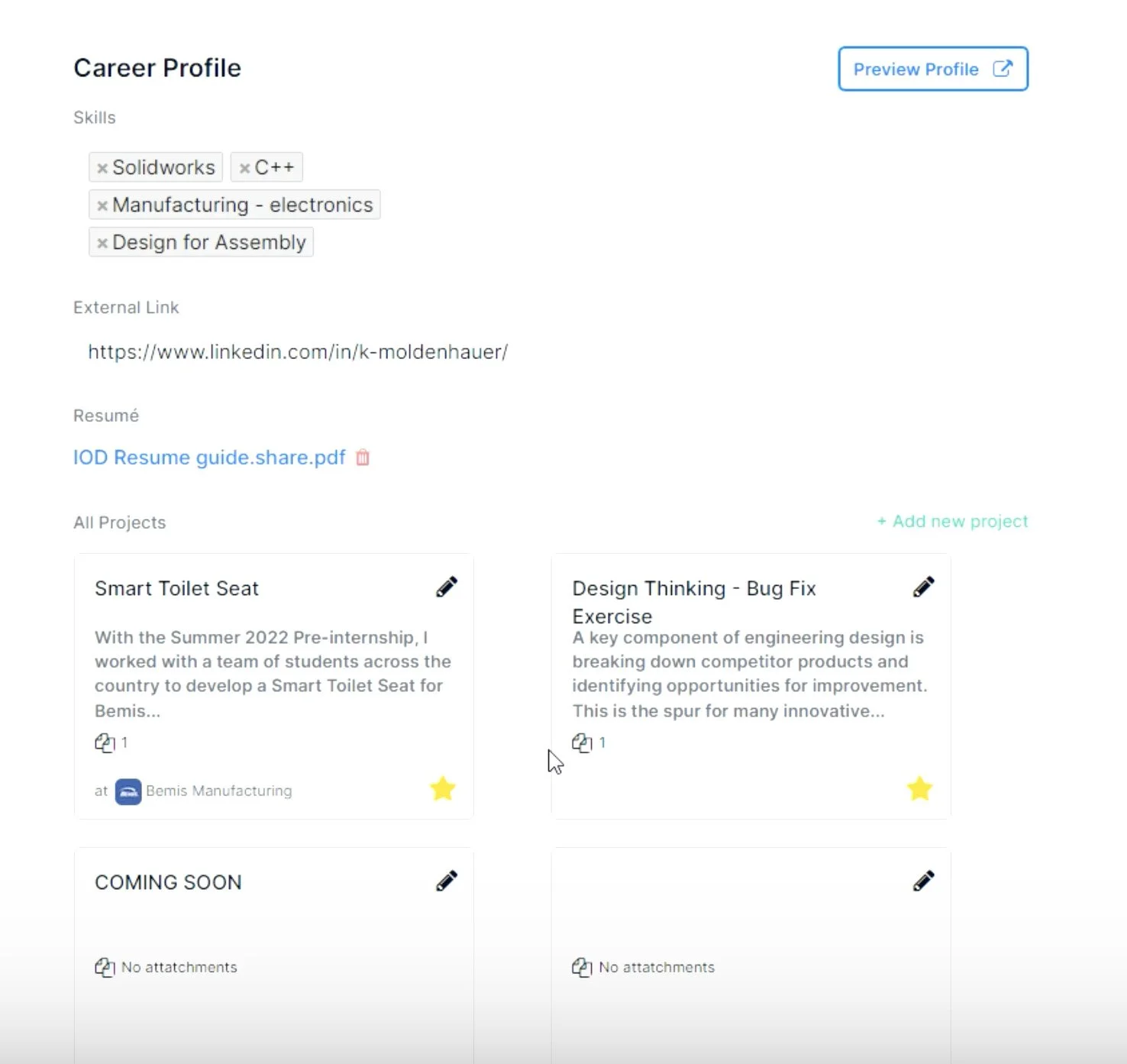
Improvements for Task #2
Add an assignment to the portfolio within IOD platform
Renamed and relocated the “Portfolio” option to the profile navigation menu
Introduced visible call-to-action buttons for “Add Project”
Added confirmation and error-prevention messages with accessible, human-readable language
Clarified public/private visibility of uploaded projects to the portfolio and sharing it with prospective employers.
It wasn’t obvious that clicking “Preview Profile” would take users to their actual portfolio page.
Redesigned profile UI: Clearer labels and improved visibility
Final prototype: A student-centered experience that delivers clarity, control, and confirmation.
My design revisions addressed the root issues uncovered during user research:
Increased visibility of features
Better language clarity
Confirmation and error-prevention patterns
These updates enabled users to feel confident completing key tasks, supporting IOD’s mission to empower students in their professional development.

