
NEAT-O App
Client: University of Minnesota Medical School; Department of Psychiatry Research Project funded by the National Institutes of Health
From Clinic to Pocket: Designing NEAT-O, a Cognitive Behavioral Therapy App for Opioid Addiction Recovery
NEAT-O (Negative Emotions and Addiction Tools for Opioid Use Disorder) is a mobile cognitive behavioral therapy (CBT) app developed at the University of Minnesota Medical School to support people in recovery from opioid-use disorder.
The app is based on NEAT-A, a proven digital CBT program for alcohol addiction, originally delivered on clinic computers and designed to be used in tandem with treatment from a healthcare professional.
Clinical psychologists leading this project saw an opportunity to adapt NEAT-A’s content for opioid-use disorder and reimagine it as a mobile app to increase accessibility and impact for those unable to regularly attend in-clinic sessions.
PLEASE NOTE: Some details of this project are omitted or obscured to respect proprietary information and confidentiality agreements.
My Roles:
• UX/UI Product Designer
• Content Strategist
• UX Researcher
• Digital Project Manager
UX Methods:
• Surveys & Competitor Analysis
• Personas
• User Flows
• Site Maps
• Usability Testing
My Tools:
• Figma
• Amplitude Analytics
Deliverables:
• High Fidelity Interactive Prototypes
• Personas, User Journey Maps, User Flows, Site Map
• Design Deck - Redacted for content
• Analytics Tracking Plan
• Accessibility Audit
• Design System and Style Guide
• Content Management & Requirements Documentation
• User Desirability Report
As UX Project Manager and lead product designer, I guided the project through discovery, design, prototyping, content strategy, and implementation.
Project Summary
Individuals managing opioid-use disorder, alongside anxiety and depression, need a comprehensive, accessible, and secure solution for recovery, but existing platforms fail to address these complexities. Limited access to mental health and addiction support makes timely help difficult.
NEAT-O aims to bridge this gap with a dedicated mobile app offering on-demand therapeutic support, allowing users to engage at their own pace. It features progressive learning paths, personal practice tools, goal tracking, and access to critical resources, while ensuring HIPAA-compliant security.

Low Fidelity Mock-Up

Medium Fidelity Mock-up

High Fidelity Mock-uo
The Problem:
How might I translate a clinically validated, desktop-based CBT program into an accessible, secure, and engaging mobile experience that supports individuals in recovery from opioid-use disorder, while maintaining therapeutic integrity, fostering intrinsic motivation, and ensuring seamless usability outside of clinical supervision?
I began by immersing myself in the existing CBT program: its structure, language, and clinical goals. Collaborating with psychologists and clinical researchers, I worked to adapt its core therapeutic components into a mobile-first framework without compromising clinical integrity.
Leading a user-centered design process, I created and tested iterative wireframes and prototypes to prioritize accessibility, WCAG compliance and usability in real-world contexts.
I partnered closely with developers and stakeholders to align on feasibility and scalability, resulting in an accessible MVP.
How I Solved It:
Product Design & Design System
To bring coherence to a complex therapeutic experience, I created a mobile-first design system that streamlined component use across screens and ensured consistency, accessibility, and developer efficiency. The system enabled rapid iteration across multiple MVP versions, each tested and refined.

Screenshot of the NEAT-O design system I created on Figma
This design system I built has laid the foundation for consistent future releases and faster developer handoff.
Accessibility & Inclusive Design
To ensure NEATO was inclusive and met accessibility standards, I conducted an in-depth audit of key, high-interaction screens such as account registration, lessons with media, personal practice inputs, and interactive data visualizations. This included enhancing contrast, ensuring proper label structures, increasing tap target sizes, and improving keyboard navigation support. The result was a more usable, human-centered app experience for individuals with varying abilities, aligned with WCAG 2.1 guidelines.
Furthermore, I advocated for partnering with WeCo Accessibility Services, a trusted third-party expert in digital accessibility. Their formal audit is scheduled to take place soon and will provide additional insights and recommendations. This step reinforces my commitment to designing an inclusive, WCAG-compliant experience from the ground up.
Regulatory Compliance
Because NEATO is a prescription-only digital therapeutic, it was essential to design the app in alignment with both FDA guidelines and HIPAA regulations. This meant prioritizing data security, privacy, and clinical integrity throughout the design process.
I collaborated closely with stakeholders to ensure the user experience supported these standards, designing interfaces that clearly communicated consent, safeguarded personal health information, and upheld the therapeutic intent of the app without introducing misleading or gamified elements that could undermine clinical outcomes.

UX Research & Strategy
I discovered that users could feel overwhelmed by rigid input formats and unmotivated by superficial rewards. To address this, I designed NEAT-O with free-form text boxes for CBT exercises to support authentic self-expression, while avoiding gamification tactics that could undermine intrinsic motivation.
Designing for Depth: How User Research Shaped NEAT-O’s Approach to Motivation and Expression
To better understand users’ needs, limitations, and motivators, I conducted a desirability survey with 76 participants focused on the value of free-form text entry in mobile mental health apps. The findings were clear: users wanted the flexibility to write in their own words, especially for therapeutic tasks like journaling or cognitive restructuring. They expressed comfort with open-ended input, particularly when guided by prompts or supportive features like spell-check and editability.
These insights directly influenced NEAT-O’s design, leading to the inclusion of free-text boxes in core CBT modules enabling users to reflect and articulate thoughts in a way that felt more natural and personally meaningful.

Deliverable: Screenshot of the User Desirability Results Report I created on Google
At the same time, I explored user motivation:
What keeps people engaged in daily mental health tasks, especially in the context of recovery?
Many CBT apps lean on gamification techniques, but research and testing showed that excessive reliance on external rewards like badges can undermine intrinsic motivation, especially in addiction recovery, where sustainable change must come from within.
Drawing from behavioral psychology literature, I designed NEAT-O to promote intrinsic motivation through features like mood and progress tracking. Instead of incentivizing basic participation with points, NEAT-O encourages meaningful engagement by supporting users’ own goals and progress.
The result is a therapeutic app experience grounded in empathy, evidence, and user insight; One that supports clarity, emotional expression, and intrinsic commitment to recovery without overwhelming or distracting users with unnecessary behavioral nudges.
Content Strategy & Translation of Clinical Language
Working with clinical psychologists and a copywriter, I helped translate complex, evidence-based CBT therapy into compassionate, digestible language tailored to the lived experience of opioid addiction.
I focused on reducing cognitive load and maintaining therapeutic fidelity, especially in emotionally vulnerable moments.

Content Strategy
I built the user experience around a few core principles:
Clear: Clear signposting of next steps, module completion, and progress milestones.
Supportive: Designing flows that feel encouraging and empowering, not punitive.
Simple: Prioritizing straightforward navigation and minimizing decision fatigue.
Accessible: Meeting or exceeding WCAG standards to ensure usability for all users.
I edited therapeutic modules to improve clarity, reduce jargon, and meet 6th-8th grade reading levels.
I ensured consistency in voice and tone, and worked with clinical psychology researchers to align language with visual design and interaction patterns.
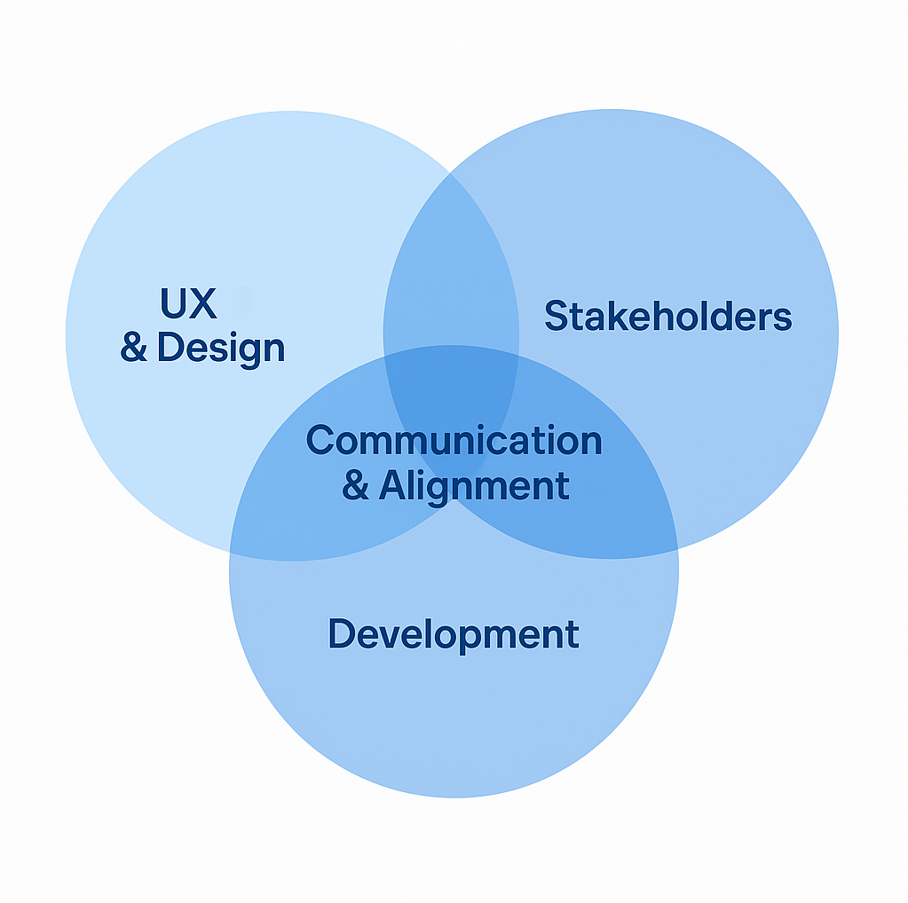
Cross-Functional Collaboration
I acted as a key liaison between the clinical, design, and engineering teams, aligning user needs with feasibility and ensuring design intent carried through development. I wrote implementation specs, coordinated sprint tasks, and provided QA feedback on mobile builds.
Implementation & Handoff
I translated the final designs into annotated prototypes and collaborated with developers during sprint planning and QA. I worked closely with the dev team to troubleshoot implementation challenges and ensure design fidelity. I also coordinated updates when clinical or technical requirements changed mid-development.
Measurement & Evaluation
To support both UX iteration and future clinical trials, I developed an analytics tracking plan aligned with core outcomes: task completion, session retention, and feature engagement. This allowed the team to assess what features were resonating with users and where adjustments were needed.

Measuring Impact & Continuous Optimization
Problem: Post-launch, many apps fail because they don’t track real user behavior effectively. There was a need to measure whether users engaged with therapy content and whether features met their intended goals.
Solution: I defined UX metrics early on. I created an analytics tracking plan to measure engagement, retention, and task success rates.

While outcome data is still being collected, NEAT-O’s MVP was built to empower users in recovery by improving accessibility, emotional engagement, and user autonomy.
The Value I Added
I helped reimagine a clinically effective in-clinic therapy for a broader, mobile-first audience without losing its therapeutic heart. By building strong foundations in design, language, research, and implementation, I supported the transformation of NEAT-A into a scalable mobile tool that can reach people in recovery wherever they are.
My work ensured that NEAT-O is a thoughtfully adapted experience designed for the complexities of opioid addiction recovery in everyday life.
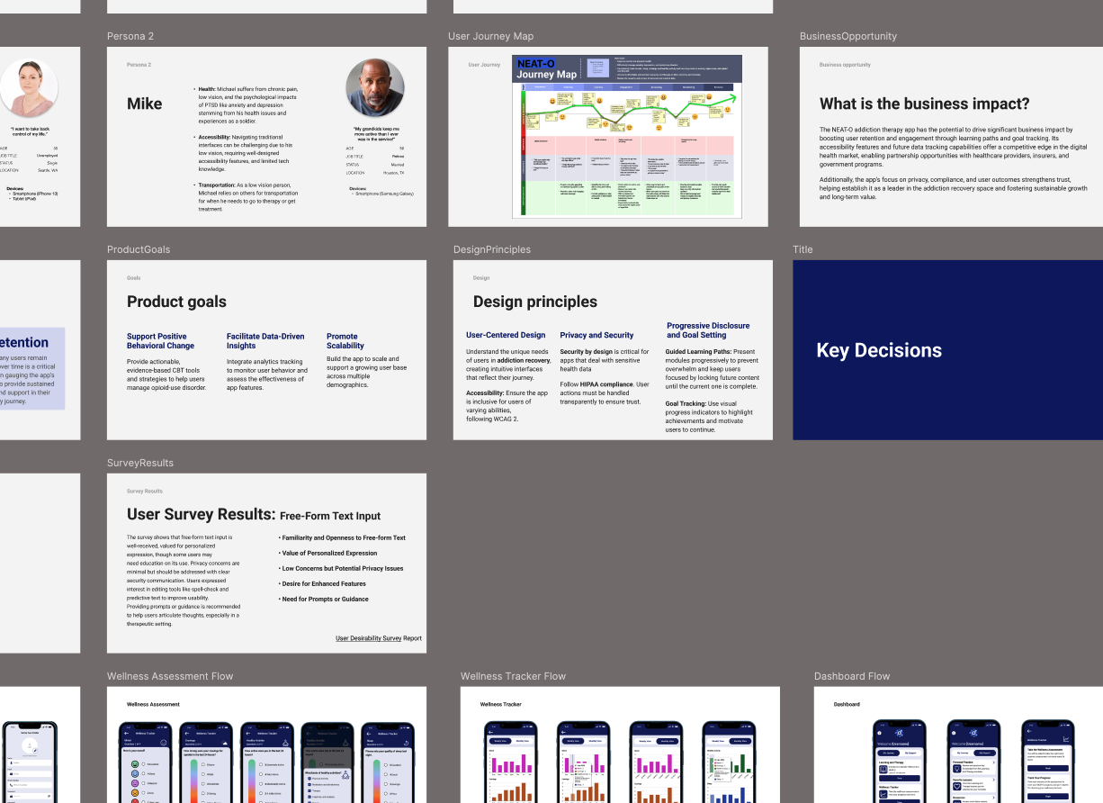
Deliverable: Screenshot of the NEAT-O Design Deck I created on Figma